Emma Knickerbocker
Concept Artist & Game Designer
Projects
Sketchbook
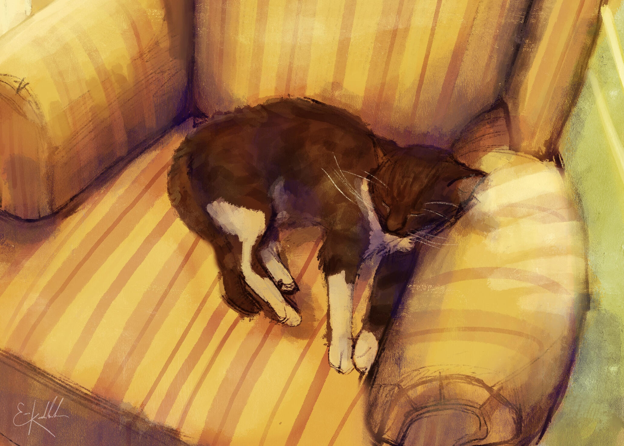
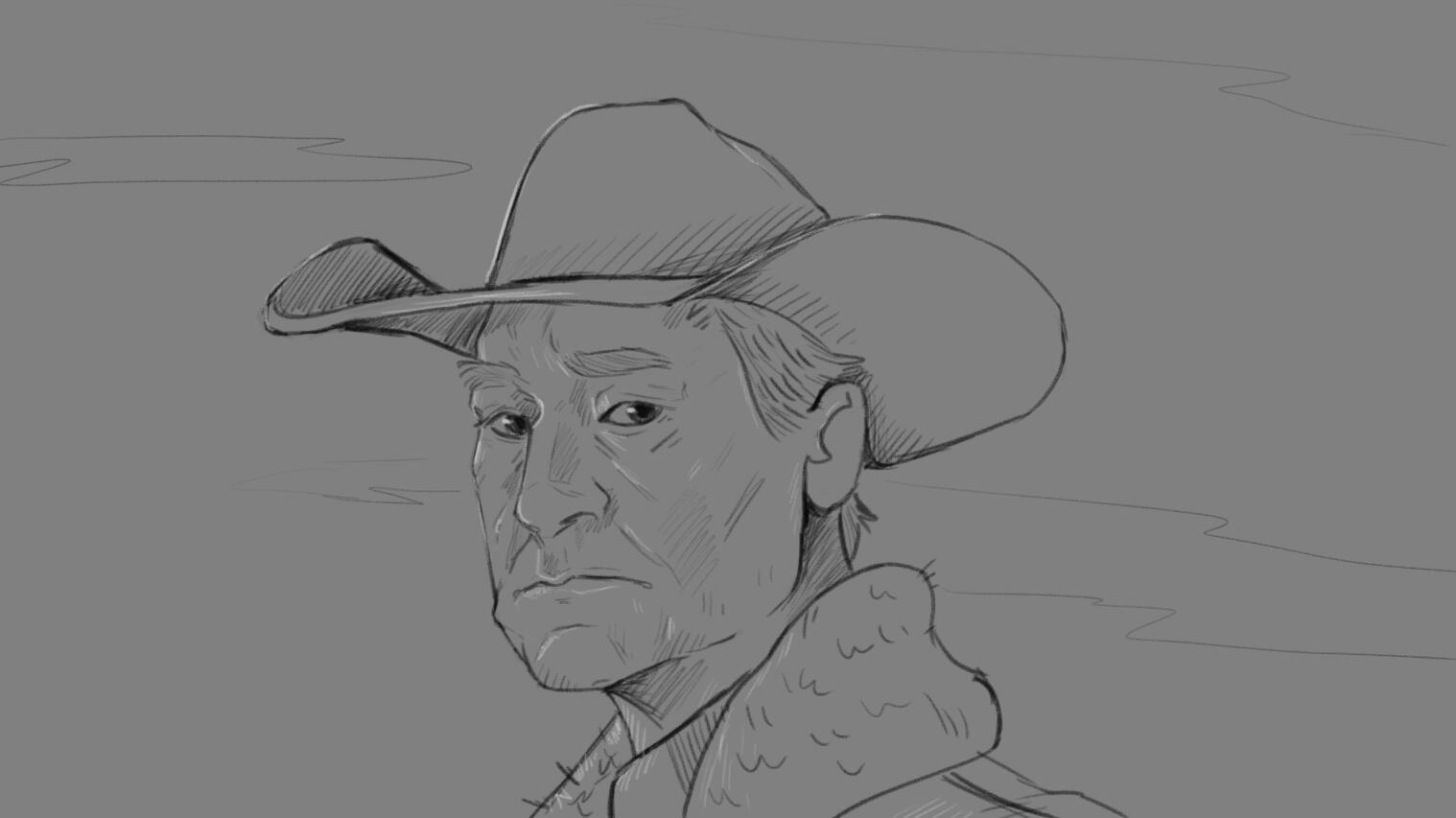
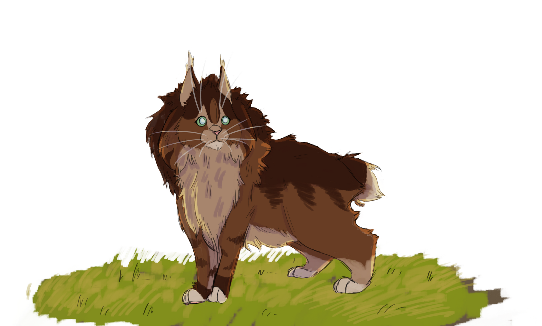
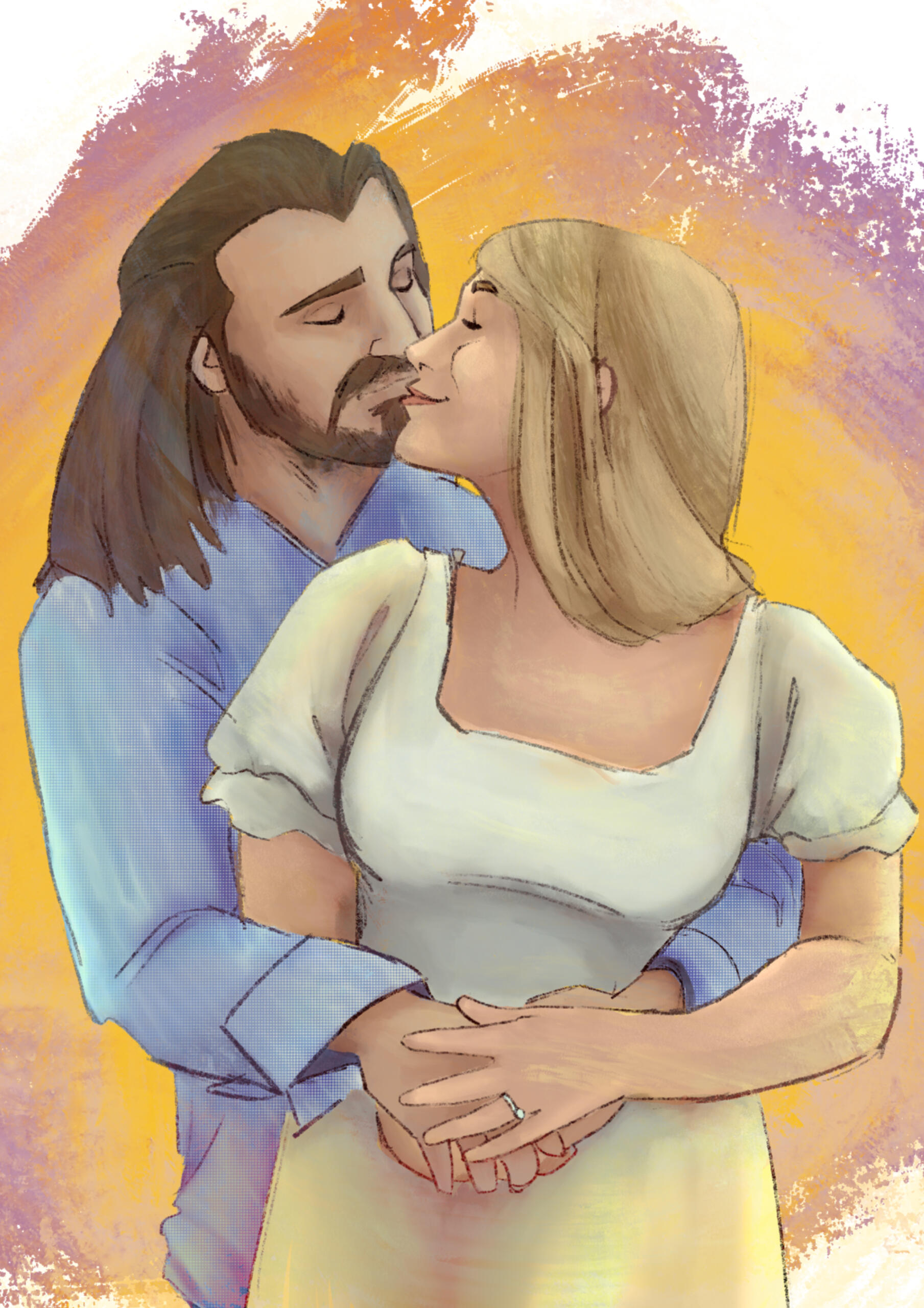
A collection of personal projects and artwork.
Emma Knickerbocker
Concept Artist & Game Designer
I'm a concept artist and game designer who specializes in character design and player experience.My core value as a designer and an artist is to craft games that are unique to the player through memorable characters and thrilling game designs that engage the player for a fun, immersive experience.I graduated from Shawnee State University with a BFA (Illustration) in April 2022. I currently freelance for DigiQube Games as a concept artist and Little Dragon Studios as a storyboard/concept artist.
Quick Swap Caverns
Character & Prop Artist
Participant's Choice & Jim Hudson AwardsShawnee State Global Game Jam, January 2021
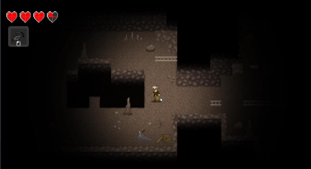
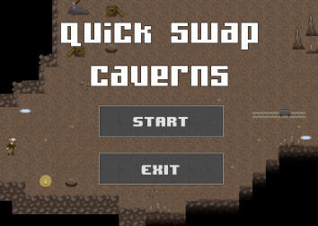
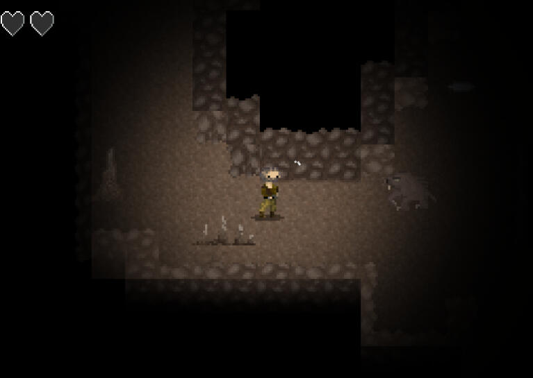
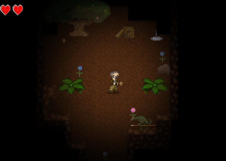
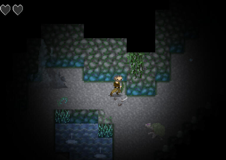
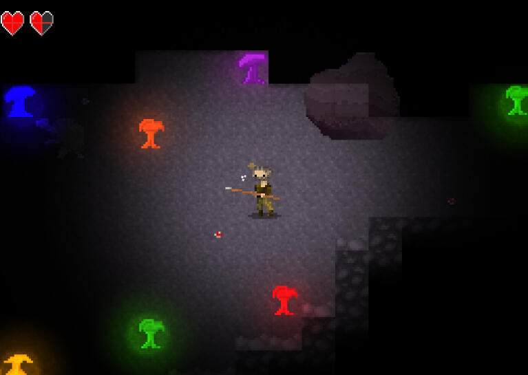
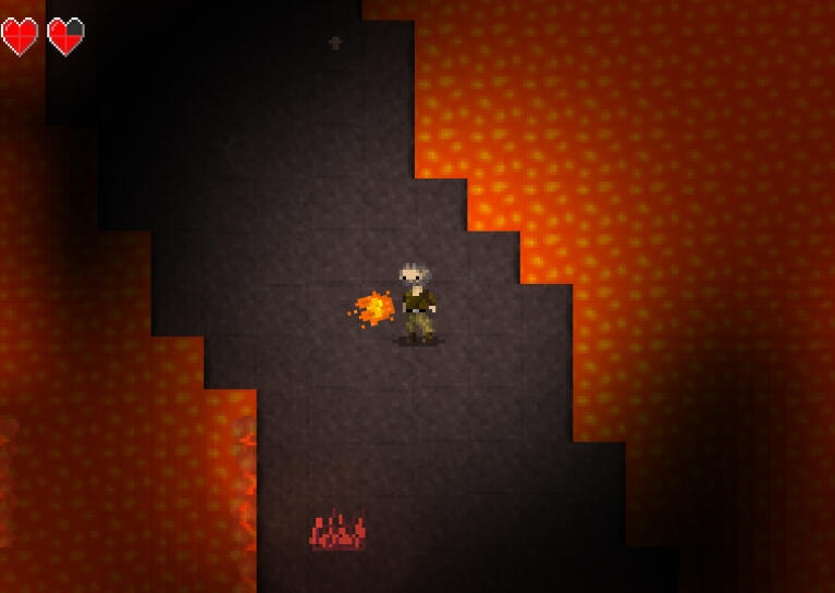
Quick Swap Caverns is a 2D action-adventure top-down game. You play as Tomathy Jones, a butterfingered treasure hunter who is cursed to lose his weapon every time he kills the monsters that dwell in the caverns he explores.
Role OverviewCharacter Artist
- Worked with a lead artist to establish visual targets
- Adapted to specific visual styles for a cohesive look
- Created all character designs
- Modified & optimized characters based on feedbackProp Artist
- Created some props & populated levels with props
Platform: PC
Tools Used: Github, Aseprite, Procreate, Godot Engine
Duration: 3 days
Team Size: 8
Characters
Mole FighterThe mole fighter was the first enemy that I designed. The idea was that the mole would be the first and most basic enemy the player could fight. We originally planned on the narrative being something along the lines of the explorer accidentally stumbling on a lost civilization of mole people, but we ultimately scrapped that since it would create a far more complex narrative and scope than what we aimed for. Instead, we opted for using generic mole characters. He uses claws as his only attack.Glow WormThe glow worm was the second enemy that I designed. A mechanic we wanted was something that would leave a trail that damaged the player if they walked over it, and I thought it would be awesome to have the bioluminescent aspect of some real-life worms included in Quick Swap Caverns. The glow worm ended up being a late-stage enemy, and it provided the player with a slime trail weapon when they killed the worm.Mushroom GrenadierThe mushroom grenadier was one of the final enemy NPCs we planned for. These guys throw "grenades" that explode into a poisonous cloud, and they keep these weapons strapped around their shoulders.I liked the silhouette of the mushroom grenadiers and thought that it gave a really nice diversity in appearance from any of the other designs. These guys blend in well with their lush, underground jungle environment. Their darker tones allow them to move more with the shadows and can be seen best when they're standing next to one of the bioluminescent mushroom "trees". This was one of the team's favorite enemies!


Other Monsters & LevelsWe wanted to have a diverse selection of weapons and a visually strong group of monsters, so there are a couple more that we ended up tossing in last minute for some extra weapon options. They include a turtle whose shell the player can shield charge with, a lizardfolk with a spear, a bear with a sword, and a firefly that spits fire. I didn't get to sketch these because we didn't have much time, so these were designed on the go by me and the art lead!


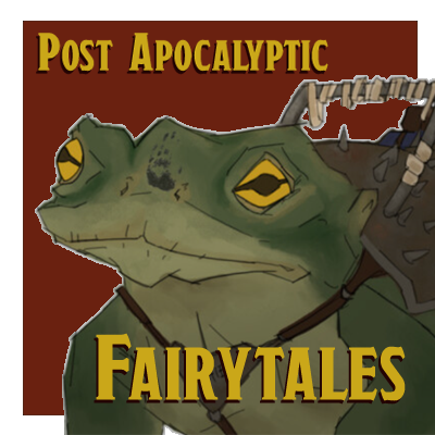
Post Apocalyptic Fairytales
Concept Artist
Senior Studio - Final Project
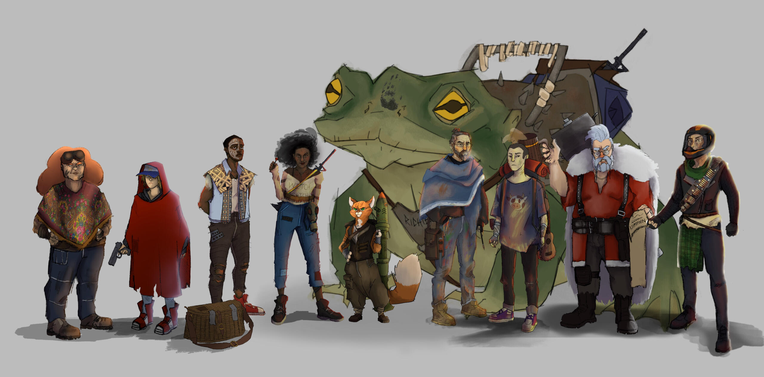
For my final year in college, I was to create 10 character concepts. They could be inspired by something or each be completely random - there was a lot of freedom. I decided to have a theme based on the idea of figures from fairytales, legends, and other folklore, and to design them as if they were in a post-apocalyptic world. I did extensive research on their stories to get a true understanding of what these literary figures are like and portray them in interesting ways.I created moodboards for the characters using PureRef and drew from multiple scholarly and non-academic sources to achieve unique results. The characters below are the most successful designs I created.
Baba Yaga
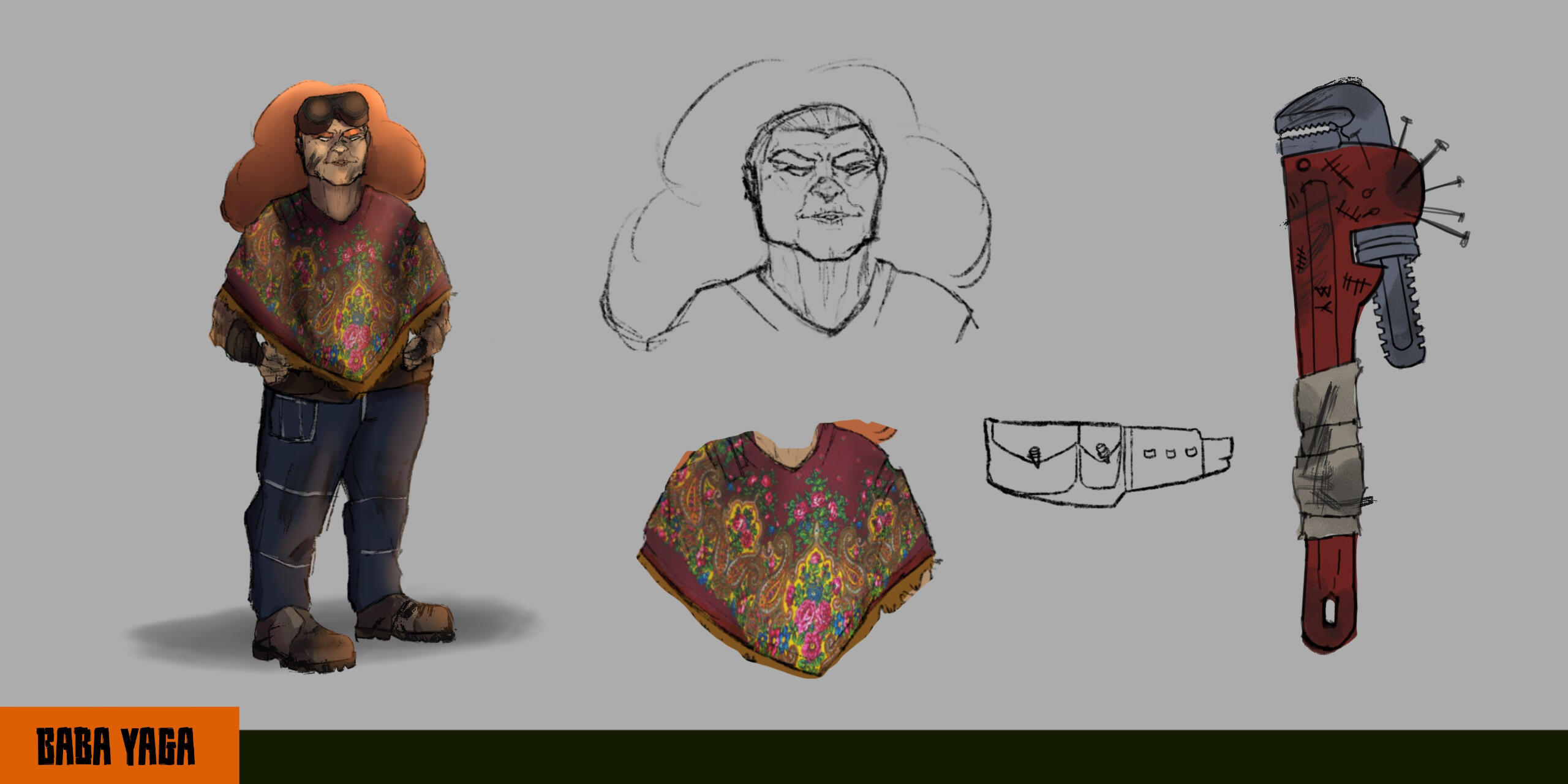
Baba Yaga was the first designs that I started drafting. I remember watching the Love, Death, and Robots episode "Suits" and absolutely falling in love with the old woman. One of my favorite character archetypes is the chaotic old woman who likes to blow things up. One aspect of that particular episode is that they move in these giant mechanical suits, and the old woman in that seems to live in hers to some capacity.I thought that I could implement that idea with Baba Yaga since she lives in her mobile chicken-legged house, so I gave her a mechanic background for fixing things on the go. I originally made some sketches for her house, but I didn't have enough time during the school year to really dig into that.From what I researched, Baba Yaga is of Eastern European origin. I wanted to keep that because I think it's vital to who she is as a fairytale character, so I gave her a poncho (I'm not sure if that's the proper term, I apologize if it's offensive!) with distinctly Eastern European designs on it.
Cheolsoo (Jack Frost)
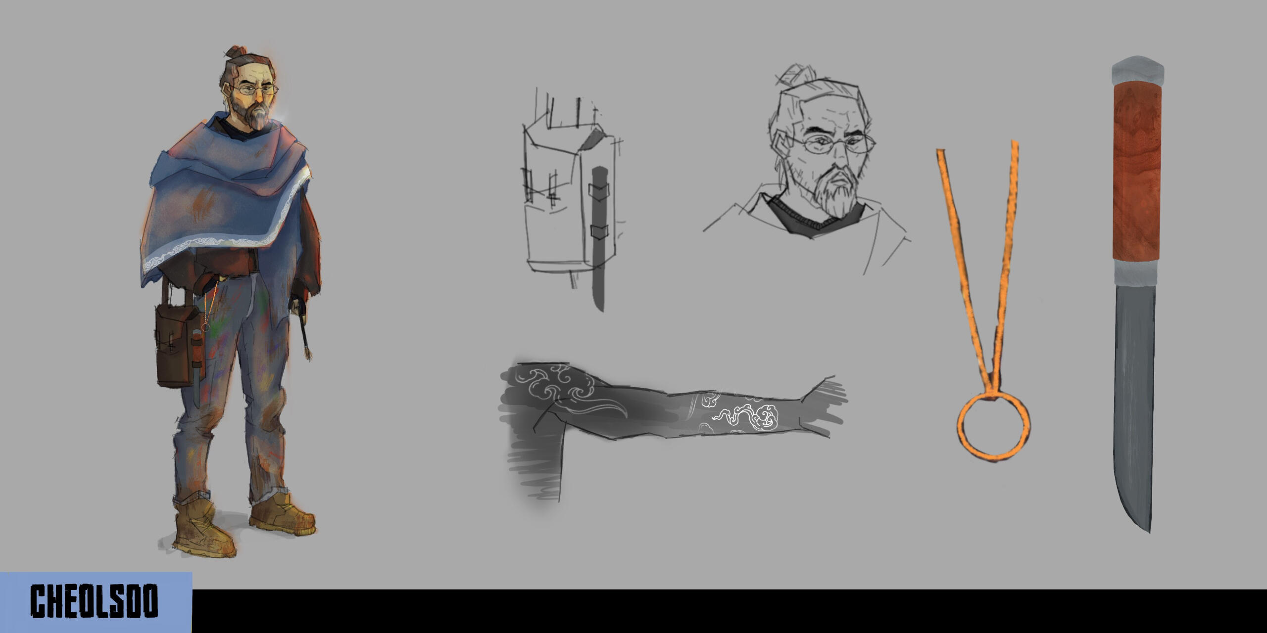
Cheolsoo, which is the Korean name for "Jack Frost", is a soft-spot character for me. While doing research, I found that some descriptions of Jack Frost depict him as an artist whose medium happens to be the cold, hence the frost pattern on windows during the winter. I imagined that Cheolsoo would keep in touch with this side of him even after the world ended, so I gave him his paintbrush and a satchel where he keeps his remaining art supplies. He's not without his weapons, however, so Cheolsoo keeps a knife on him, one that's used for quick and precise movements that reflect his artwork.I liked the theme of intricacies throughout Cheolsoo's design. His personality is written in the details: his tattoos are reminiscent of the frost-tipped paintings on windows, his clothes are marked with art and grit, and his outward appearance is crafted to cover up his history, revealing it only when he means to. That's why he holds a necklace that's hidden away in his pocket, and why he has a large cloak that obscures most of his body.
Constantine
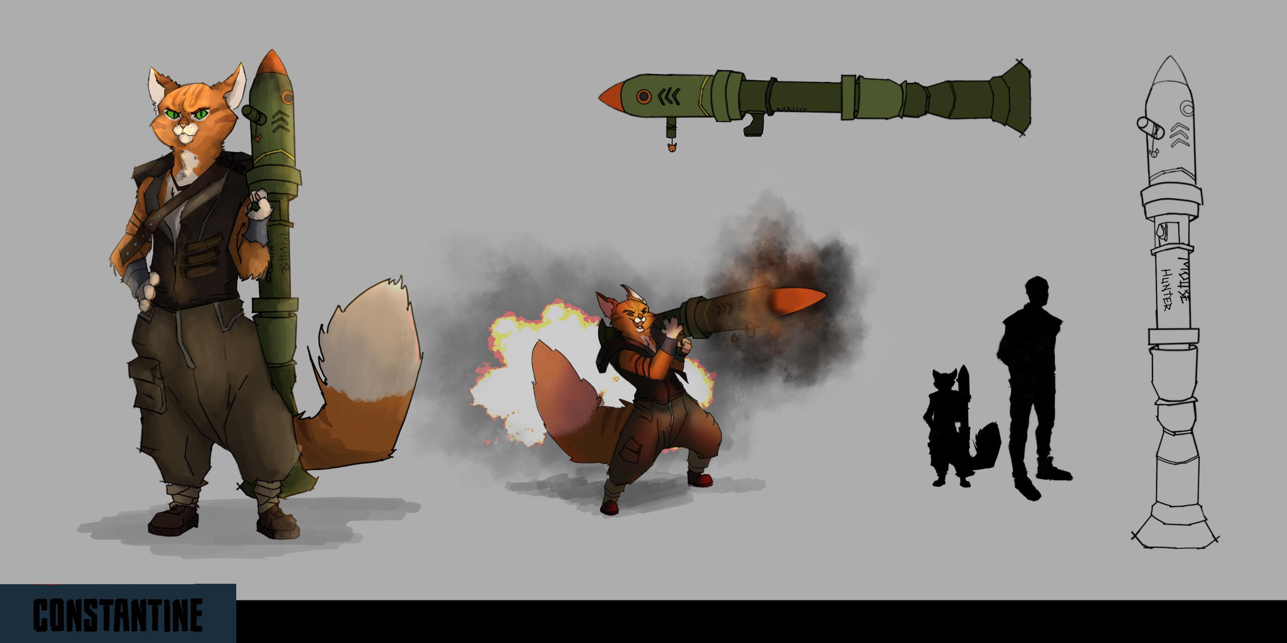
Constantine was such a fun character to explore! Puss in Boots was a must-have fairytale figure to include, and I love super chaotic, destructive characters. So I turned Puss in Boots into a rocket-wielding fanatic bipedal cat named Constantine. He seems like the kind of guy that would take a lot of care in his weaponry, so I customized the rocket launcher that he lovingly calls "Mousehunter". A neat personal touch I added is that the head of the rocket is meant to look like a fish with three gills. I enjoyed learning how to do weapon design in this one!
Hansel & Gretel
Hansel & Gretel were created alongside each other in order to ensure that they would actually look like they're related. I knew that I wanted to give an Afropunk style to the siblings because I thought it looked really cool. African culture is so unique and fascinating to me. I added some African tribal design elements to Hansel's vest and the paint on his face to keep him more grounded in the African aesthetic.When I read their stories Gretel always seemed like the spunkier and reckless type, so I gave her a bit of a crazier look. She'd be the type to customize whatever she could to fit her style, so I gave her a unique strap for her gun. It's based on a strap I have for one of my guitars, so I thought it'd be a fun personal touch.My favorite little addition to Hansel's design is the white stone he has as a necklace. In one version of the fairytale, Hansel leaves white stones instead of bread as a trail to remember the path home from the woods. So I figured that Hansel could have one white stone around his neck, and then use the others in the slingshot he carries.
Little Red
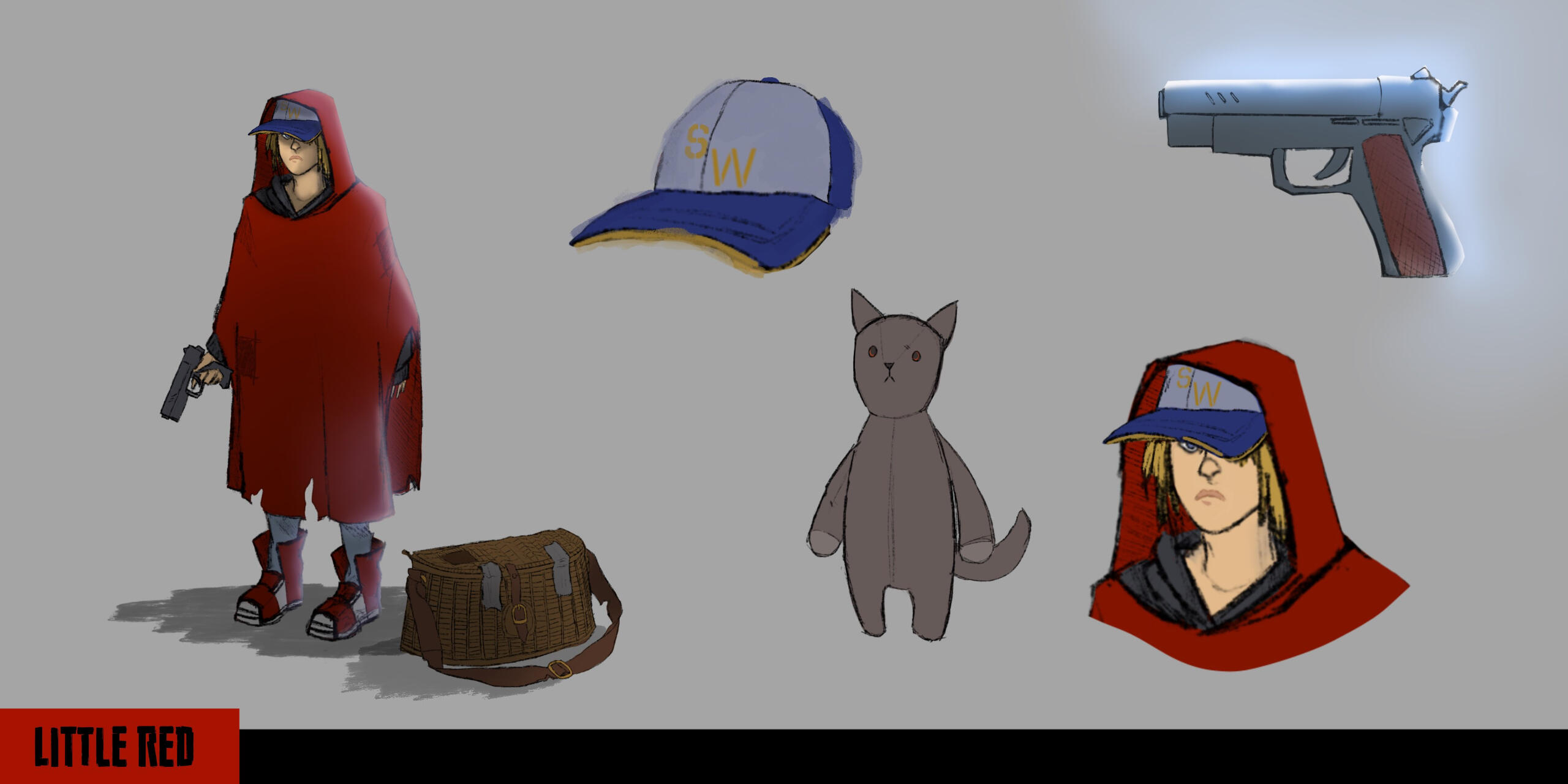
Little Red Riding Hood was easy in the sense that it was super obvious as to what her character should be. I wanted to make her different, but not different to the point where I'm reinventing the wheel with who she is. I imagined that she'd be from some wet climate like Seattle (I had just finished playing The Last Of Us Part II, to be fair), so the reason she had a red hood at all was because she's been carrying a red poncho everywhere.I wanted to bring back the basket and turn it into something practical. Most designs of Red Riding Hood I see have a normal basket that feels like it's there for aesthetic purposes, but Little Red was very clever in older versions of the fairytale. She was resourceful and cunning. I gave her the basket to carry supplies in -- namely the little stuffed wolf she carries with her for protection and companionship. It's beaten and worn down from travel, among other reasons.
Mr. Nick
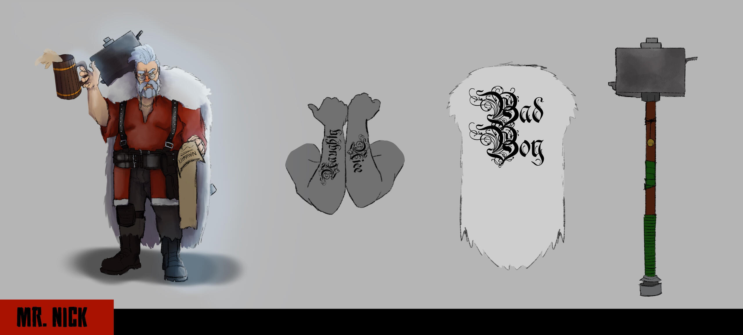
Santa Claus was an obvious choice for me to play with. I liked the idea of him knowing everything and getting to places quickly, so I considered him to be something like an information broker in this world. He's the kind of guy that's great as an ally, but you definitely don't want to cross him. All of his allies and enemies are kept on official lists so that people know who they can and can't be associated with. He's a toxic ally.Mr. Nick is as physically powerful as he is knowledgeable. He carries a giant hammer that's put together from his adventures roaming the wasteland. I added the bell as a nod to one of my favorite elements of the design of the clickers in The Last Of Us: a simple little sound that strikes absolute fear. The jingle of a bell is enough for anyone to know that Mr. Nick is coming, and he's NOT happy.His fur cape is a simple but necessary element. Not only does it help solidify the connection to his Santa Claus persona, but it also gives him a bigger, intimidating appearance. Essentially, this guy is big, he's bad, and he's not afraid to flaunt it.
Richie
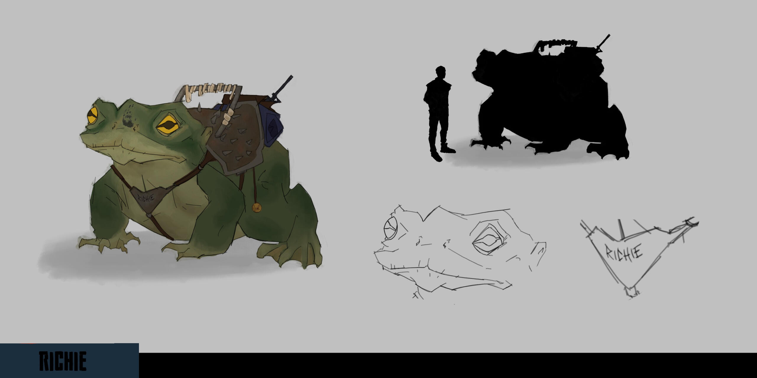
I really wanted this group of characters to have some kind of vehicle to travel on, but I also wanted an element of charm. Nothing brings a party together like a giant animal, so Richie was born. Each character has something special about them, but what I like about Richie is that he's literally just a frog that happens to be big. Excluding his size, he's a normal frog. Everything special about him - the handprint, the saddle, the nameplate - comes from the people he travels with.Richie is derived from the Princess and the Frog. I learned that one of the other characters has a name, so I took it and edited it down to "Richie" as a pet name.
The Great Divide
Concept Artist
DigiQube Games
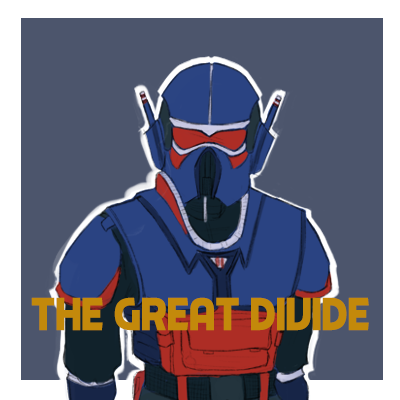
The Great Divide is a currently ongoing project. It is an FPS campaign with a retro-futuristic take on the Cold War and the option to take either side of the war.I joined DigiQube as a concept artist, and have helped in honing the visual style of the game by creating an art document.
Platform: PC
Tools Used: Photoshop
Duration: Ongoing
Team Size: 16
Character Design Overview
The FDS, or the "Federation of Democratic Systems", is the retro-futuristic version of the United States. The SUSR, "Solar Union of Socialist Republics", acts as the opposing force, a Communist government that seeks to wipe out the FDS in order to achieve a Communist utopia.I wanted the FDS and the SUSR to have their own distinct looks while remaining true to the main goal of the game: playing two sides of a war where both factions believe they're the objective "good guy". With that in mind, you can't really allow either side to have the typical "good guy/bad guy" designs. I drew strongly on real-life inspirations for more grounded elements, and 1960s/70s sci-fi shows and movies for the sci-fi elements. Since The Great Divide isn't supposed to have a far-future feeling to it, I decided that drawing inspiration from anything with a hard sci-fi feel wouldn't be a great idea.I gave each faction three pillars to focus on as well their own color palettes, each color having their own meaning to help players subconsciously decipher what class they're facing on the battlefield. I also made sure there were guidelines to follow on certain aspects of the armor, such as how much armor a certain class would have or how much of a certain color was painted on. This would make it easier for translating armor similarities across both factions (i.e. the FDS Recon should be conceptually similar to the SUSR Recon, but with their own aesthetic flavoring).
FDS Uniforms
The three pillars I have for the FDS are as follows:- Patriotic ("branded"). I wanted to create a feeling of patriotism for both factions, of course. I don't think it'd be believable if only one side felt strongly about their beliefs. It shows differently in FDS because they proudly brand themselves with marks of their government. This is achieved through means such as patches and symbols on the armor itself.- Rounded. To get a good difference in the actual shape of the armor, I assigned the FDS with more rounded features. A lot of this is reminiscent in athletic armor, so you might notice similarities to football shoulder pads or motorbike helmets in some classes.- Mass-produced. This is a pillar that's shared with the SUSR.
Operator
The Operator is the middleman class, acting as an infantry unit between all four. He has no buffs or nerfs, and his armor serves as the template for other classes. It was vital to ensure that his armor was done first so that we could properly do the other class armors based off of his. Out of all four classes, this one specifically was made to look like a "grunt".Because he's the basic guy and the color blue represents the base color for FDS, the Operator was given blue as his most common color. Red served as the secondary, and white accented his plates.I achieved the look of the Operator by taking an initial sketch and doing three iterations of it. I did this in a loop until finally arriving at the look of the Operator. I also included some helmet explorations I did while trying to figure out how heavy I wanted the Operator's armor to look.
Striker
WIP
Vanguard
WIP
Recon
WIP
SUSR Uniforms
WIP
Environment Design Overview
WIP
Sancorria (Demo Level)
WIP
Outlaws
Game Designer
Game Design & Documentation Project
Outlaws is a 42-page document that I created for a game design & documentation class. We had half of a semester to conceptualize and document a game and pitched the game on the last day of class as well as answered questions about the game. Each week was required to have a devlog, and we gave feedback on each other's games.This document has an overall game summary as well as a Game Design Document and an Art Direction Document. I included links to playlists and a sizzle reel I made.In Outlaws, you explore a metropolis riddled with crime in a gritty, noir comic book world as a vigilante whose only goal is to put down superhumans - even the ones considered "heroes". Hone in your skill, upgrade your weapons and abilities, and do everything within your power to make sure they pay for their crimes.
Overview
Overall Game Summary
I narrowed down the target audience for Outlaws and created pillars that would focus on crafting the best player experience. Outlaws is made for players who enjoy a good narrative mixed with thrilling combat and powerful tools, and a progression system to increase the power and ability of said tools.I compiled a list of inspirations and references to build the game on (complete with specifics on what to draw from media and what to take away). This helps hone in on what the tone and mood are.Arguably the most important factor of this document is the Player Experience Pillars. I wanted to make Outlaws super engaging to someone wanting to beat up powerful and corrupt superheroes. A part of the premise of the game is, "What if Batman wanted to take out the Justice League?" So I leaned heavily into that aspect with three main pillars that I would always refer back to if I felt something else further down the document was off. I made sure to include at least one of these pillars for the rest of my pillars in order to keep it cohesive and alive.
Game Design Documentation
Game Design Direction
The gameplay pillars are hunt down your target, clear out the city, and perfect your skill. Players who are competitive and enjoy combat tend to really like this sort of thing, so I took this as in-depth as I could from a gameplay stance. One way I did this was to make the enemy boss and minibosses feel really powerful so that it would be more gratifying when the player beats them. Players are acquainted with the general idea of how these bosses fight based on the NPCs that exist in their regions.The critical path of the game starts when the player takes out the first miniboss. Each superhero apart of the Alliance (the league of superheroes guarding Charlemagne) controls a borough, and each borough is unlocked once the miniboss before them is taken out. After a borough is unlocked, players can access it at any point. Each hero also gears the player up to face the final boss, called the Warden.There are several loops going on that the player takes part in. The primary loop has you: explore the area for the boss --> prep for the fight --> fight and beat the boss --> gain XP.During the "prep" phase, the player goes through a sub-game loop where they have to locate the target through their investigative abilities. During the "exploration" phase, the player can work to clear out the boroughs and upgrade their skills and gadgets.
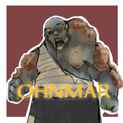
Ohnmar
Character & Prop Artist
Incomplete Game Jam, June 2022
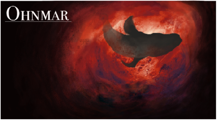
Ohnmar was an (unfortunately) short but otherwise very valuable learning experience for me! The premise of the game was that you played as a monk who was accidentally swallowed up by a giant, ancient whale. With the water rising and the solitude slowly driving you insane, you had to make it out quickly in order to survive.
Platform: PC
Tools Used: Github, Aseprite, Procreate, Photoshop, Godot Engine
Duration: 1 month (Incomplete)
Team Size: 10
Role Overview
Character Artist
- Designed main character & enemy NPCs
- Created character & enemy spritesUX/UI Artist
- Created some button spritesDesigner
- Set up a workflow/pipeline within the art department & to other departments
- Created an art document that dictated what programs, inspirations, & styles we used
- Asked & answered important questions for the art team
- Utilized the strengths of the art team
Main Character
We knew that we wanted to have a Buddhist monk, so a couple of us sketched out some designs that were put up for a vote by the entire team. Mine ended up being the one that was used. I took inspiration from Buddhist and Shaolin warriors. A part of Ohmar's aesthetic was that it was grounded in realism, but the player explored an almost fantastical environment. Magic was never an option, but evoking that mysterious, otherworldly feeling was a necessity to create a sense of wonder.In talking through what this character might be like, we came to a decision that the monk is a resourceful type. So we gave him a giant fishbone that he could use as a melee weapon throughout the game using his previous knowledge with a bo staff.


Enemy NPCs
The enemy NPCs were fun to play around with. We didn't get far enough in development to figure out what the abilities of each were, but we knew that we wanted to have a very distinct silhouette for each enemy type, and for these "zombie" characters to have a progression to them both visually and mechanically. Another cool thing that we would have implemented was a mixture of different cultures within these characters to signify how much the whale had eaten.


UX/UI
Truthfully, I never thought that I would touch UI. It became a necessity due to the constraints of the project at the time, and I ended up really enjoying taking the time to think about how the UI might look.


Scream Jam 2023
Head Artist
October 2023
We ran into a lot of issues with the team during the entirety of this event, unfortunately. The game was left barely developed in the end, but I learned a little bit about animation, pixel art, and directing a small art team!
Platform: PC
Tools Used: Github, Aseprite, Procreate, Photoshop, Godot Engine
Duration: 1 month (Incomplete)
Team Size: 10
Role Overview
Head Artist
- Determining the roles of other artists
- Creating a pipeline
- Creating a spreadsheet for assets
- Creating an art document
ConceptsWhat we wanted to do with the monsters was up in the air for a long while. I sketched out a couple of ideas before anything was concrete, which is the first four sketches. I took ideas from a lot of things, but "a" is my favorite one! I drew inspiration from the Jotunn in The Ritual (one of my favorite horror movies).We soon settled on going for an eldritch/Lovecraftian inspiration. One of our artists already had some cute sprites that we could take and transform into our own designs, so I grabbed those and made some scarier designs.DirectionThese are some directions/inspiration boards I made for the team! We wanted a nice blend of cute pixel and eldritch horror - something like Castle Crashers mixed with Undertale.
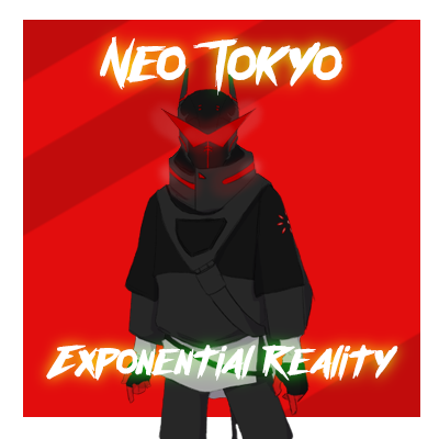
Neo Tokyo: Exponential Reality
Personal Project
This was a challenge that ArtStation did one summer. I initially started to follow, but I found I wasn't able to keep up, so I turned it into something I worked with on the side.
Preperation
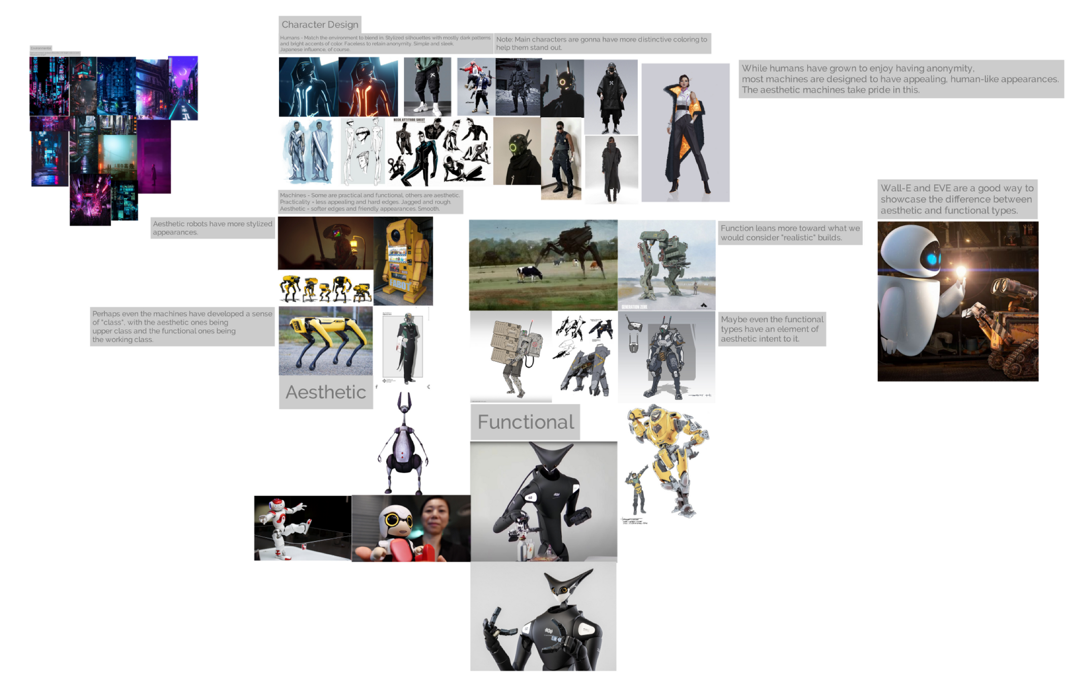
MoodboardI started the challenge by nabbing some references of ideas of how my version of Neo Tokyo was going to look. I liked the idea of having a sort of class conflict going on with robots themselves, and a disconnect between humans and robots. I also thought it'd be interesting to separate human and robot looks by having humans generally look sleek and anonymous while robots tried to make themselves look unique. The conflict orchestrated for the world-building aspect of this is a big factor of the character design.
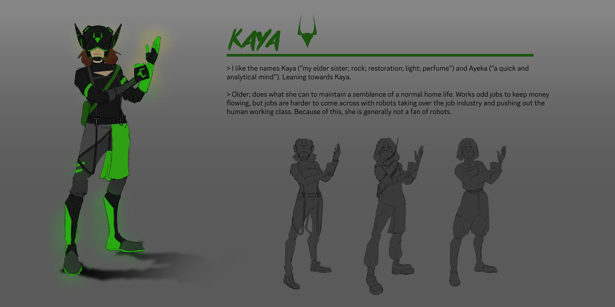
PlanningThe prompt asked for a certain number of humans and robots for the character design aspect. I did some research on Japanese culture and myths (while remaining as respectful as possible), and from that I came up with the idea of a sibling duo. Sometimes, I like to write down my thoughts before I delve into drawing. In this case, it did help me pinpoint some important parts of each sibling's design and why they chose to look the way they do.I feel as though it's almost inevitable to use the look of the kitsune in most Japanese cybernetic settings. One angle I explored here was taking that popular figure in pop culture and turning it into something deeper with more purpose other than just a fox that is mischevious. So, I researched the deity Inari and found that there are two halves to them, which I split into the siblings. Masato represents the industrious, sword-making aspect of Inari, and Kaya is the benevolent side of Inari that protects the home.
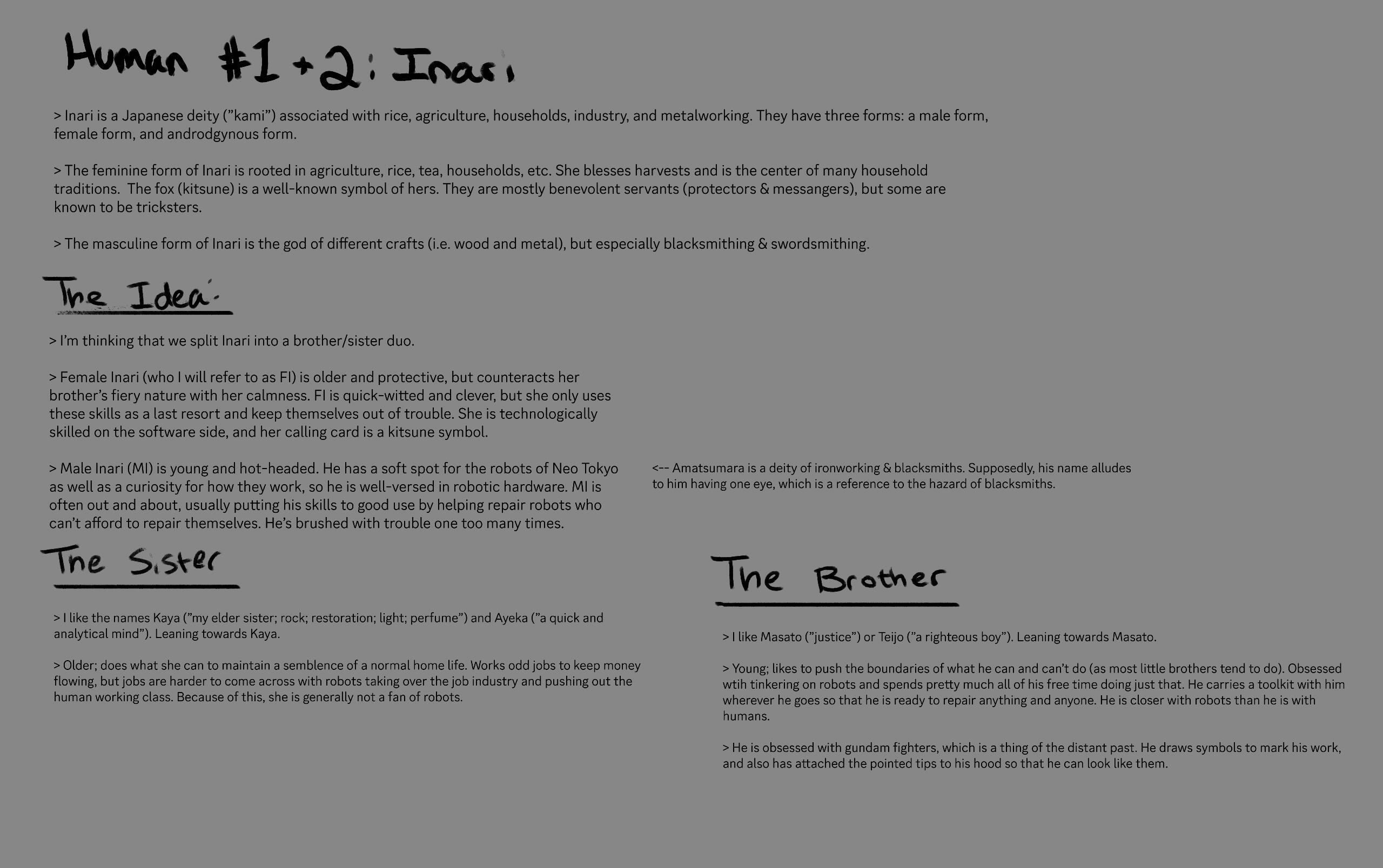
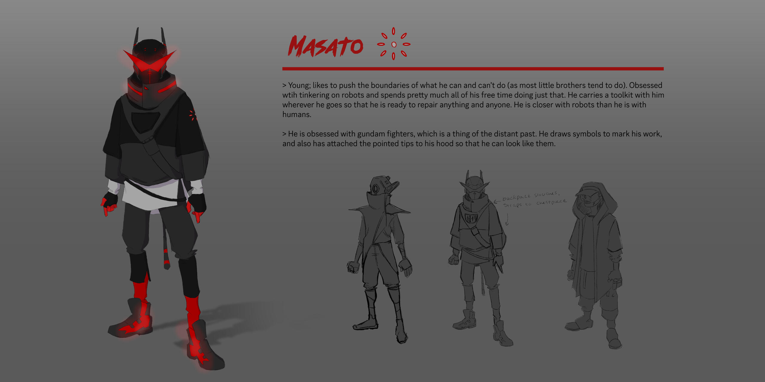
MasatoMasato, the younger brother, is someone who wants to look different. He wants to stand out from everyone else in Tokyo and be noticed. So, I took into consideration what the color percentage would be for the average Tokyo citizen and added more color/white to Masato. Since average NPC types will typically don dark clothing, the amount of red and white on Masato will be considered a lot to an average citizen.I love color psychology and meaning. The Japanese consider red to be a color of power and strength, and since Masato is a fiery kind of kid, I figured it was a suitable choice. Not only that, but he would certainly choose this color on the basis alone that it's super bright. The elemental meaning of red (fire) also matches Masato's generally destructive presence.
KayaKaya is Masato's elder sister. Taking on the wise sibling role, Kaya opts to keep her head down and out of trouble. I imagine that, at some point, she had a dream similar to that of Masato's, where she would stand out among crowds. But with the reality of survival coming down on her, she stays as the sole reliable and steady source of the household.Her reluctance to appreciate the presence of robots directly goes against Masato's view of them, as he loves to work with them and is obsessed with how they work. But a necessity for survival forces Kaya to learn about the software that runs robots, which creates tension in her every day life.
Unannounced Mermaid Game
Roblox Project
I currently volunteer for an animation studio, but recently we decided to shift gears and try our hand in creating a video game!
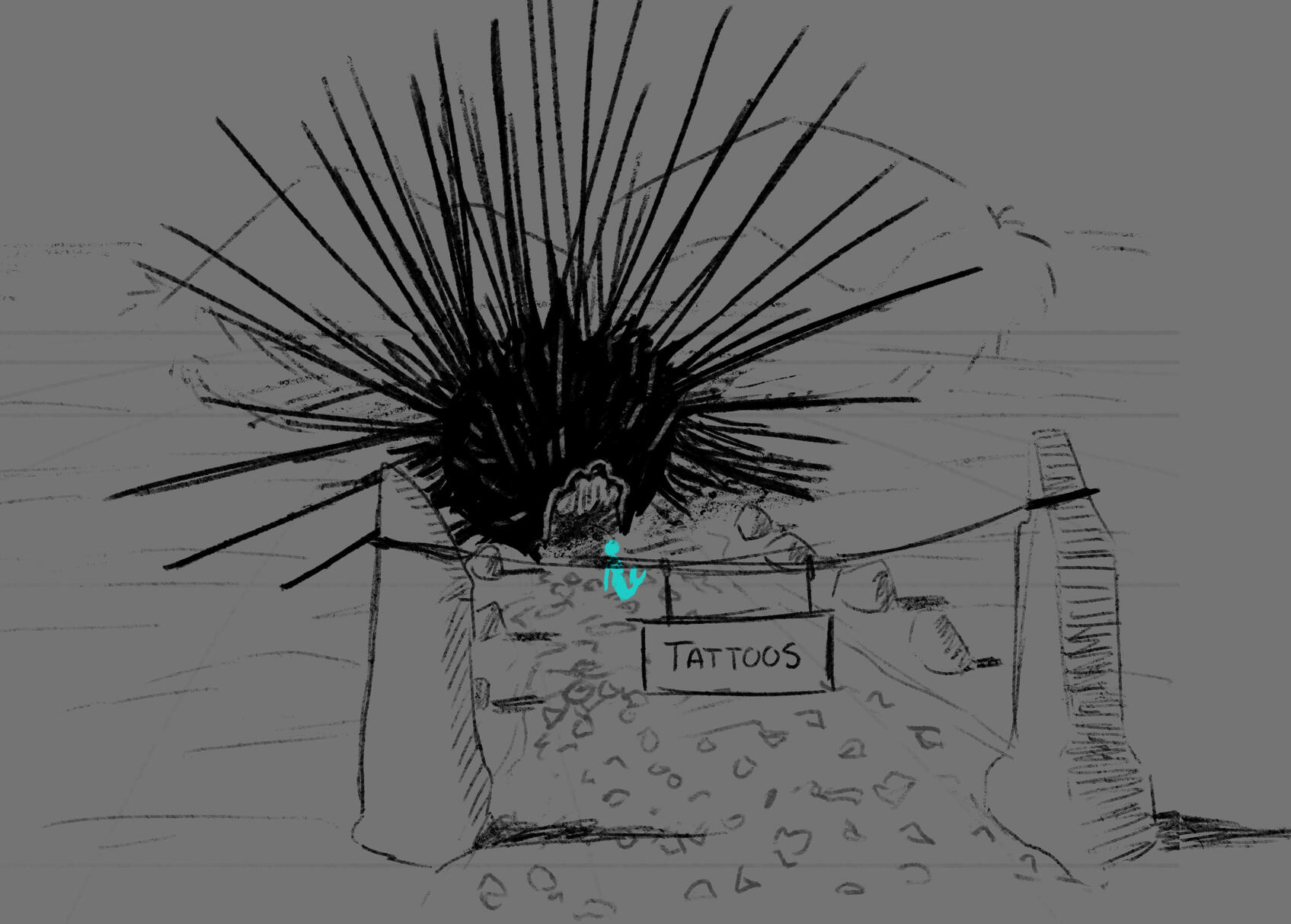
Tattoo Shop (Exterior)
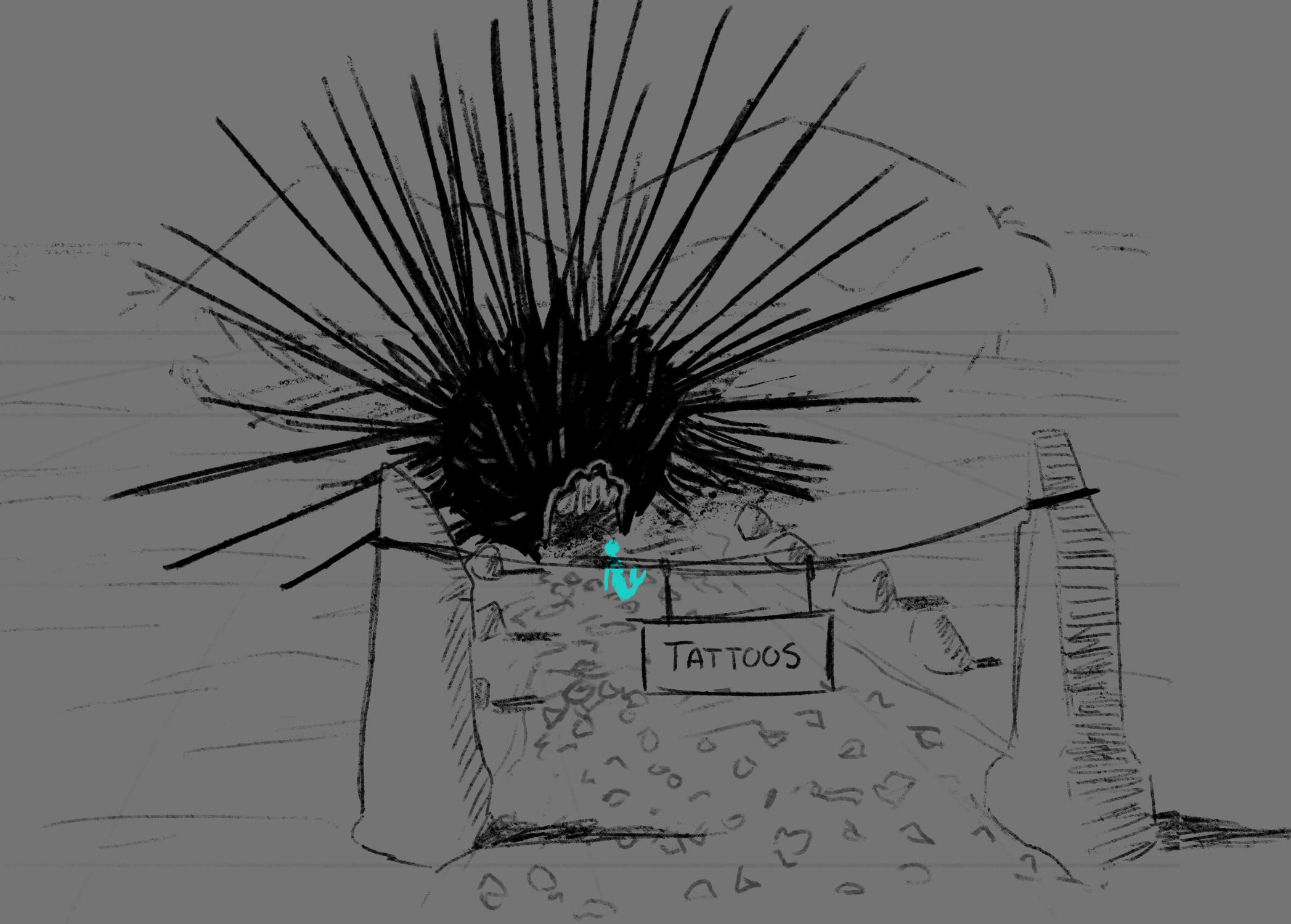
I volunteered to design the tattoo shop that players can go to. Here, players can select and buy patterns to customize their mermaid avatar with.I wanted the shop to stick out from the rest of the shops and houses in town. The shop owner is described as someone with a goth or punk aesthetic, so I combined the idea of a unique-looking store with the visually dark look of someone like that and came up with a carved-out sea urchin. Some of this visualization was inspired by how Gru's house looks in the Despicable Me franchise.
Tattoo Shop (Interior)
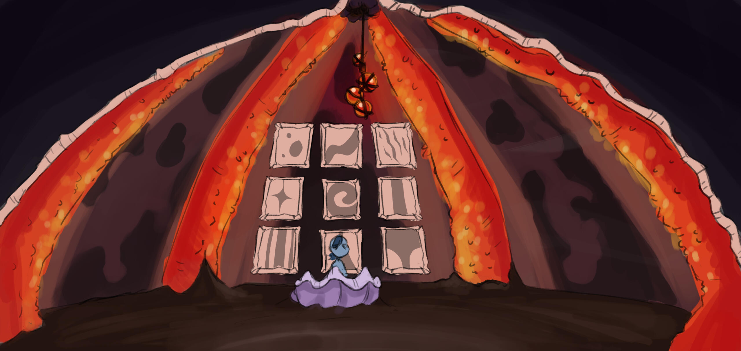
When looking into what a sea urchin might add to the visual look of this shop, I found something I thought was really cool! The interior of an urchin almost looks as though it could be glowing, at least in the images I saw, which naturally supplied the idea of a sort of bioluminescent feel to the place. I've suggested bioluminescence as a quality to the game more times than I care to admit, but there's something so unique about being able to have an environment that can support that! So, I added a small element of that here to kind of tie into other parts of the game where bioluminescence is more prominent.Hanging from the center point of the urchin building is something reminiscent of a chandelier. The look of the baubles was inspired by those eggs at the beginning of Finding Nemo. I've always loved the look of those!I fancied the appeal of providing players with the opportunity to see a flat image of the patterns they were browsing, hence the nine framed panels behind the clam "cash register".
Little Dragon Studios
Animation Studio
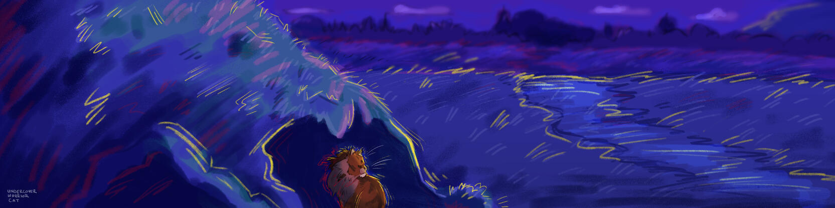
I work as a Storyboard Artist for Little Dragon Studios! We're best known for our Warrior Cats 3D animated adaptation, but due to copyright issues, we're now working on new projects that have yet to be announced.
Into the Wild: Episode 2I joined the team towards the end of Episode 1, so 99% of the work I did was toward Episode 2. Unfortunately, anything past Episode 1 was scrapped since we legally weren't allowed to work on it. That being said, this was my first experience being a Storyboard Artist, and I had fun with it! My uncertainty shows in this first scene, but it was a good starting point.
Unannounced ProjectI can't disclose this one until I confirm I'm allowed to!
Sketches
This is a collection of things I've sketched out for fun or trying to learn something new!